Sunday, June 3, 2012
Wednesday, May 23, 2012
Sunday, May 20, 2012
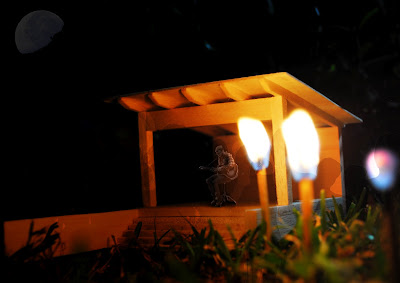
Night Time Montage
This montage aims to capture the live performance aspect of Dallas' art and suggests a garden type show that is low key, and intimate.
Thursday, May 10, 2012
Exterior Montage
Montage-It!
CLIENT
Dallas Green (of City And Colour)
Dallas Green is a Canadian born folk acoustic musician formerly of the post hardcore band Alexisonfire.
When designing for Dallas Green, his themes within his music were the driving force behind the scheme. He sings about the simple things in life, such as love, loss, friends and family as well as his love for his country.
The main idea of the 'Green Pavilion' is it is to be as simple as possible, with its main job being to sit within the Canadian environment without much impact.
The pavilions main role is to simply protect the user from the harsh Canadian climate, therefore it is open on 3 of the four sides.
It utilises a heavy stone wall at the rear and on all sides, one of which protrudes out into the landscape, to act as an invitation and guide to frequent users.
The heavy stone walls acts to tie the pavilion with the ground, something I believe is important to the musician.
Monday, May 7, 2012
Monday, April 30, 2012
1:50 Fisher House Model
I chose to do the main model in Balsa wood for the obvious reason of how important timber is in the materiality of the house.
I modeled the base in a Grey foam core board to resemble the stone foundations. I feel that no matter what material was used for the base, it just had to be significantly different from the balsa wood to portray the heavy material of the stone.
As seen in the images above, the roof and second floor are removable so the ground floor spaces can also be viewed.
Monday, April 23, 2012
Barcelona Pavilion
I believed it was important to express the symmetry and reflectivity in this building, therefore I attempted to construct the model entirely out of balsa with the exception of a transparent film over the pools.
Wednesday, April 4, 2012
Monday, March 19, 2012
Poster + Rendered Drawings
Draft Poster
Renderings
I chose to render my plan, elevation and perspective using varying grades of pencil. I believe pencil was more successful than using colour for this particular house as it shows light and dark.
I chose to have the sun from the north east as it shows the light in the living, dining kitchen area from the expanses of glass on that particular facade.
Subscribe to:
Comments (Atom)


