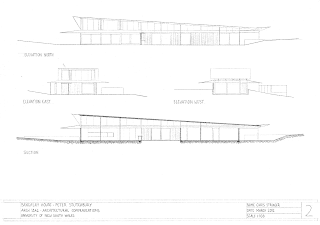
Draft Poster
Renderings
I chose to render my plan, elevation and perspective using varying grades of pencil. I believe pencil was more successful than using colour for this particular house as it shows light and dark.
I chose to have the sun from the north east as it shows the light in the living, dining kitchen area from the expanses of glass on that particular facade.


